


In this post, we will learn how to implement quantile normalization in Python using Pandas and Numpy. We will implement the quantile normalization algorithm step-by-by with a toy data set. Then we will wrap that as a function to apply a simulated dataset. Finally we will examples of couple of visualizations to see how the data looked before and after quantile normalization.
Let us first load the packages needed for implementing Quantile Normalization in Python and illustrating the steps to compute quantile normalization.
import pandas as pd
import numpy as np
import seaborn as sns
import matplotlib.pyplot as plt
from scipy.stats import poisson
Say, you have hundreds or thousands of observations from multiple samples. Quantile normalization is a normalization method that assumes statistical distribution of each sample is exactly the same.
Normalization is achieved by forcing the observed distributions to be the same and the average distribution, obtained by taking the average of each quantile across samples, is used as the reference.
The figure below nicely illustrates the steps needed to perform quantile normalization. And we will follow the steps to implement it in Python. The figure is taken from a recent paper in bioRxiv, titled “When to Use Quantile Normalization?”. Check out the paper for more details on quantile normalization.


Let us create a dataframe with some toy data to do quantile normalization. The dataframe here contains the same data as the WikiPedia page on quantile normalization.
df = pd.DataFrame({'C1': {'A': 5, 'B': 2, 'C': 3, 'D': 4},
                   'C2': {'A': 4, 'B': 1, 'C': 4, 'D': 2},
                   'C3': {'A': 3, 'B': 4, 'C': 6, 'D': 8}})
Our toy dataframe has three columns and four rows.
print(df)

       C1	C2	C3
A	5	4	3
B	2	1	4
C	3	4	6
D	4	2	8
Step 1: Order values in each column
The first step in performing quantile normalization is to sort each column (each sample) independently. To sort all the columns independently, we use NumPy sort() function on the values from the dataframe. Since we lose the column and index names with Numpy, we create a new sorted dataframe using the sorted results with index and column names.
df_sorted = pd.DataFrame(np.sort(df.values, axis=0), index=df.index, columns=df.columns)
The dataframe after sorting each column looks like this. By doing this, we are grouping observations with high/low values together.
df_sorted

	C1	C2	C3
A	2	1	3
B	3	2	4
C	4	4	6
D	5	4	8
Step2: Compute Row Means
Since we have sorted each sample’s data independently, the average value each obeservation i.e. each row is in ascending order.
Next step is compute the average of each observartion. We use the sorted dataframe and compute mean of each row using Panda’s mean() with axis=1 argument.
df_mean = df_sorted.mean(axis=1)
We get mean values of each row after sorting with original index.
print(df_mean)

A    2.000000
B    3.000000
C    4.666667
D    5.666667
dtype: float64
These mean values will replace the orginal data in each column, such that we preserve the order of each observation or featur in Samples/Columns. This basically forces all the samples to have the same distributions.
Note that the mean values in ascending order, the first value is lowest rank and the last is of highest rank. Let us change the index to reflect that the mean we computed is ranked from from low to high. To do do that we use index function assign ranks sorting from 1. Note our index starts at 1, reflecting that it is a rank.
df_mean.index = np.arange(1, len(df_mean) + 1)
df_mean
1    2.000000
2    3.000000
3    4.666667
4    5.666667
dtype: float64
Step3: Use Average Values to each sample in the original order
The third and final step is to use the row average values (mean quantile) and replace them in place of raw data in the right order. What this means is, if the original data of first sample at first element is the smallest in the sample, we will replace the original value with new smallest value of row mean.
In our toy example, we can see that the first element of the third column C3 is 2 and it is the smallest in column C3. So we will use the smallest row mean 2 as its replacement. Similarly, the second element of C3 in original data has 4 and it is the second smallest in C3, so we will replace with 3.0, which is the second smallest in row mean.
To implement this, we need to get rank of original data for each column independently. We can use Pandas’ rank function to get that.
df.rank(method="min").astype(int)

C1	C2	C3
A	4	3	1
B	1	1	2
C	2	3	3
D	3	2	4
Now that we have the rank dataframe, we can use the rank to replace it with average values. One way to do that is to conver the rank dataframe in wide to rank data frame in tidy long form. We can use stack() function to reshape the data in wide form to tidy/long form.
df.rank(method="min").stack().astype(int)
A  C1    4
   C2    3
   C3    1
B  C1    1
   C2    1
   C3    2
C  C1    2
   C2    3
   C3    3
D  C1    3
   C2    2
   C3    4
dtype: int64
Then all we need to do is to map our row mean data with rank as index to rank colum of the tidy data. We can nicely chain each operation and get data that is quantile normalized. In the code below, we have reshaped the tidy normalized data to wide form as need.
df_qn =df.rank(method="min").stack().astype(int).map(df_mean).unstack()
df_qn
Now we have our quantile normalized dataframe.
	C1	C2	C3
A	5.666667	4.666667	2.000000
B	2.000000	2.000000	3.000000
C	3.000000	4.666667	4.666667
D	4.666667	3.000000	5.666667
Python Function to Compute Quantile Normalization
Step by step code for the toy example is helpful to understand how quantile normalization is implemented. Let us wrap the statements in to a function and try on slightly realistic data set.
def quantile_normalize(df):
    """
    input: dataframe with numerical columns
    output: dataframe with quantile normalized values
    """
    df_sorted = pd.DataFrame(np.sort(df.values,
                                     axis=0),
                             index=df.index,
                             columns=df.columns)
    df_mean = df_sorted.mean(axis=1)
    df_mean.index = np.arange(1, len(df_mean) + 1)
    df_qn =df.rank(method="min").stack().astype(int).map(df_mean).unstack()
    return(df_qn)
Let us generate dataset with three columns and 5000 rows/observation. We use Poisson random distribution with different mean to generate the three columns of data.
c1= poisson.rvs(mu=10, size=5000)
c2= poisson.rvs(mu=15, size=5000)
c3= poisson.rvs(mu=20, size=5000)
df=pd.DataFrame({"C1":c1,
                 "C2":c2,
                 "C3":c3})
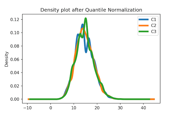
Visualizaing the Effect of Quantile Normalization
One of the ways to viusalize the original raw data is to make density plot. Here we use Pandas’ plotting capability to make multiple density plots of the raw data.
df.plot.density(linewidth=4)
We can see that each distribution is distinct as we intended.


Let us apply our function to compute quantile normalized data.
# compute quantile normalized data
df_qn=quantile_normalize(df)
Let us make the density plot again, but this time with the quantile normalized data.
df_qn.plot.density(linewidth=4)
plt.title("Density plot after Quantile Normalization")
plt.savefig('Density_plot_after_Quantile_Normalization_Pandas.png',dpi=150)
We can see that the density plot of quantile normalized data looks very similar to each other as we exprected.
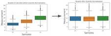
Another way visualize the effect of quantile normalization to a data set is to use boxplot of each column/variable.
Let u make boxplots of original data before normalization. We use Seaborn’s boxplot to make boxplot using the wide form of data.
sns.boxplot(data=df)
# set x-axis label
plt.xlabel("Samples", size=18)
# set y-axis label
plt.ylabel("Measurement", size=18)
plt.title("Boxplot of raw data before Quantile Normalization")
plt.savefig('Boxplot_before_Quantile_Normalization_Seaborn.png',dpi=150)
We can see that the three distributions have different mean/median.

Now let us make boxplots using quantile normalized data.
sns.boxplot(data=df_qn)
# set x-axis label
plt.xlabel("Samples", size=18)
# set y-axis label
plt.ylabel("Measurement", size=18)
plt.title("Boxplot after Quantile Normalization")
plt.savefig('Boxplot_after_Quantile_Normalization_Seaborn.png',dpi=150)
By design we can see that all three boxplots corresponding to the three column look very similar.


