

In simpler statistical models, we typically assume our data came from a single distribution. For example, to model height, we can assume that each observation came from a single Gaussian distribution with some mean and variance. However, often we might be in a scenario where that assumption is not valid and our data is more complex. Considering the same height example, we can easily see that heights from men and women can be from two different gaussian distributions (with different means).
Gaussian Mixture Models
Mixture Models are an extremely useful statistical/ML technique for such applications. Mixture models work under the assumption that the each observation in a data set comes from a specific distribution. Gaussian Mixture Models assume that each observation in a data set comes from a Gaussian Distribution with different mean and variance. By fitting the data to Gaussian Mixture Model, we aim to estimate the parameters of the gaussian distribution using the data.
In this post, we will use simulated data with clear clusters to illustrate how to fit Gaussian Mixture Model using scikit-learn in Python.
Let us load the libraries we need. In addition to Pandas, Seaborn and numpy, we use couple of modules from scikit-learn.
import pandas as pd
import seaborn as sns
import matplotlib.pyplot as plt
from sklearn.datasets import make_blobs
from sklearn.mixture import GaussianMixture
import numpy as np
sns.set_context("talk", font_scale=1.5)
Simulate Clustered Data
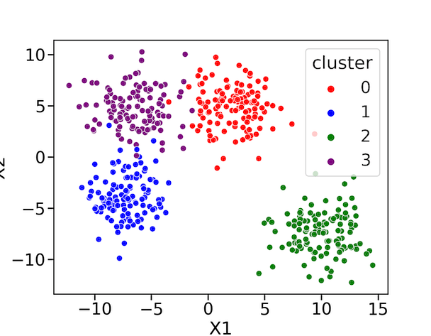
We will use sklearn.datasets’s make_blobs function to create simulated dataset with 4 different clusters. The argument centers=4 specifies four clusters. We also specify, how tight the cluster should be using cluster_std argument.
X, y = make_blobs(n_samples=500,
                  centers=4,
                  cluster_std=2,
                  random_state=2021)
make_blob functions gives us the simulated data as a numpy array and the labels as vector. Let us store the data as Pandas dataframe.
data = pd.DataFrame(X)
data.columns=["X1","X2"]
data["cluster"]=y
data.head()
Our simulated data look like this.
	X1	X2	cluster
0	-0.685085	4.217225	0
1	11.455507	-5.728207	2
2	2.230017	5.938229	0
3	3.705751	1.875764	0
4	-3.478871	-2.518452	1
Let us visualize the simulated data using Seaborn’s scatter plot and coloring the data points by its cluster labels.
plt.figure(figsize=(9,7))
sns.scatterplot(data=data,
                x="X1",
                y="X2",
                hue="cluster",
                palette=["red","blue","green", "purple"])
plt.savefig("Data_for_fitting_Gaussian_Mixture_Models_Python.png",
                    format='png',dpi=150)
We can clearly see that our data has come from four clusters.
Fitting a Gaussian Mixture Model with Scikit-learn’s GaussianMixture() function
With scikit-learn’s GaussianMixture() function, we can fit our data to the mixture models. One of the key parameters to use while fitting Gaussian Mixture model is the number of clusters in the dataset.
For this example, let us build Gaussian Mixture model with 3 clusters. Since we simulated the data with four clusters we know that it is incorrect, but let us go ahead and fit the data with Gaussian Mixture model.
gmm = GaussianMixture(3,
                     covariance_type='full',
                     random_state=0).fit(data[["X1","X2"]])
For the identified clusters, we can get the location of the means using “means_” method in GaussianMixture.
gmm.means_
array([[-2.16398445,  4.84860401],
       [ 9.97980069, -7.42299498],
       [-7.28420067, -3.86530606]])
Using predict() function, we can also predict the labels for data points. In this example, we get the predicted labes for the input data.
labels = gmm.predict(data[["X1","X2"]])
Let us add the predicted labels to our data frame.
data[["predicted_cluster"]]=labels
And then visualize the data by coloring the data points with predicted labels.
plt.figure(figsize=(9,7))
sns.scatterplot(data=data,
                x="X1",
                y="X2",
                hue="predicted_cluster",
                palette=["red","blue","green"])
plt.savefig("fitting_Gaussian_Mixture_Models_with_3_components_scikit_learn_Python.png",
                    format='png',dpi=150)
We can clearly see that by fitting the model with three clusters is incorrect. The model has grouped two clusters into one.

Identifying the number of clusters in the Data by Model Comparison
Often the biggest challenge is that we will not know the number clusters in the data set. We need to correctly identify the number of clusters. One of the ways we can do is to fit the Gaussian Mixture model with multiple number of clusters, say ranging from 1 to 20.
And then do model comparison to find which model fits the data first. For example, is a Gaussian Mixture Model with 4 clusters fit better or a model with 3 clusters fit better. Then we can select the best model with some number of clusters that fits the data.
AIC or BIC scores are commonly used to compare models and select the best model that fits the data. Just to be clear, one of the scores is good enough to do model comparison. In this post, we compute both the scores, just to see their behaviours.
So, let us fit the data with Gaussian Mixture Model with different number of clusters.
n_components = np.arange(1, 21)
models = [GaussianMixture(n,
                          covariance_type='full', random_state=0).fit(X) for n in n_components]
models[0:5]

[GaussianMixture(random_state=0),
 GaussianMixture(n_components=2, random_state=0),
 GaussianMixture(n_components=3, random_state=0),
 GaussianMixture(n_components=4, random_state=0),
 GaussianMixture(n_components=5, random_state=0)]
We can easily compute AIC/BIC scores with scikit-learn. Here we use for one of the models and compute BIC and AIC scores.
models[0].bic(X)
6523.618150329507
models[0].aic(X)
6502.545109837397
To compare how the BIC/AIC score change with respect to the number of components used to build the Gaussian Mixture model, let us create a dataframe containing the BIC and AIC scores and the number of components.
gmm_model_comparisons=pd.DataFrame({"n_components" : n_components,
                                  "BIC" : [m.bic(X) for m in models],
                                   "AIC" : [m.aic(X) for m in models]})
gmm_model_comparisons.head()
n_components	BIC	AIC
0	1	6523.618150	6502.545110
1	2	6042.308396	5995.947707
2	3	5759.725951	5688.077613
3	4	5702.439121	5605.503135
4	5	5739.478377	5617.254742
Now we can make a line plot of AIC/BIC vs the number components.
plt.figure(figsize=(8,6))
sns.lineplot(data=gmm_model_comparisons[["BIC","AIC"]])
plt.xlabel("Number of Clusters")
plt.ylabel("Score")
plt.savefig("GMM_model_comparison_with_AIC_BIC_Scores_Python.png",
                    format='png',dpi=150)
We can see that the both the BIC and AIC scores are at the lowest when the number of components is 4. Therefore the model with n=4 is the best model.


Now that we know the number of components needed to fit the model, let us build the model and extract the predicted labels to visualize.
n=4
gmm = GaussianMixture(n, covariance_type='full', random_state=0).fit(data[["X1","X2"]])
labels = gmm.predict(data[["X1","X2"]])
data[["predicted_cluster"]]=labels
The scaterplot made with Seaborn highlighting the data points with the predicted labels fits perfectly.
plt.figure(figsize=(9,7))
sns.scatterplot(data=data,
                x="X1",
                y="X2",
                hue="predicted_cluster",
                palette=["red","blue","green", "purple"])
plt.savefig("fitting_Gaussian_Mixture_Models_with_4_components_scikit_learn_Python.png",
                    format='png',dpi=150)


