A better alternative to histogram is plotting Empirical cumulative distribution functions (ECDFs). ECDFs don’t have the binning issue and are great for visualizing many distributions together.
What is an ECDF?
It is empiricial, because it is computed from the data. It is cumulative distribution function because it gives us the probability that variable will take a value less than or equal to specific value of the variable.
In an ECDF, x-axis correspond to the range of values for variables and on the y-axis we plot the proportion of data points that are less than are equal to corresponding x-axis value.
Let us see examples of computing ECDF in python and visualizing them in Python. Let us first load the packages we might use.
import numpy as np
import pandas as pd
import seaborn as sns
import matplotlib.pyplot as plt
Let us simulate some data using NumPy’s random module. Let us generate random numbers from normal distribution with specified mean and sigma.
# mean and standard deviation
mu, sigma = 5, 1
# generate random data for ECDF
rand_normal = np.random.normal(mu, sigma, 100)
# use seaborn to make histogram
ax = sns.distplot(rand_normal,
                  bins=10,
                  kde=False,
                  color='dodgerblue',
                  hist_kws={"linewidth": 15,'alpha':1})
ax.set(xlabel='Normal', ylabel='Frequency')
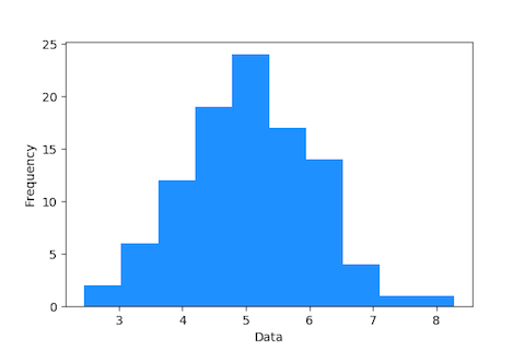
This is how the histogram will look like with 10 bins. the distribution will look completely different if we use different number of bins.

Let us compute x and y values for making ECDF plot. Our x values are simply sorted data, which is the random data we generated. And the y values correspond to the proportion of data points less than each data point. `
x = np.sort(rand_normal)
n = x.size
y = np.arange(1, n+1) / n
Now we have both x and y values computed from our data. We can make a simple scatter plot of x and y using matplotlib.
plt.scatter(x=x, y=y);
plt.xlabel('x', fontsize=16)
plt.ylabel('y', fontsize=16)
The ECDF plot below is the alternative for histogram. One thing that is striking is ECDF plot display all data points. For example we can see that our data ranges from about 2 to about 7. We can see that about 18% of the data less than or equal 4. And about 90% of the data are less than or equal to 6.

Let convert the code to compute ECDF as a function function and use it to visualize multiple distribution.
def ecdf(data):
    """ Compute ECDF """
    x = np.sort(data)
    n = x.size
    y = np.arange(1, n+1) / n
    return(x,y)
Update: Thanks to Seaborn version 0.11.0, now we have special function to make ecdf plot easily. Check out this post to learn how to use Seaborn’s ecdfplot() function to make ECDF plot.
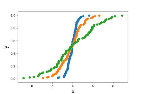
Let us generate random numbers from normal distribution, but with three different sets of mean and sigma. And compute ecdf using the above function for ecdf. Let us plot each data set on the same scatter plot.
The first distribution has mean =4 and sigma=0.5.
mu1, sigma1 = 4, 0.5
rand_normal1 = np.random.normal(mu1, sigma1, 100)
x,y = ecdf(rand_normal1)
plt.scatter(x=x, y=y);
The second distribution has the same mean =4, but with sigma=1.
mu2, sigma2= 4, 1
rand_normal2 = np.random.normal(mu2, sigma2, 100)
x,y = ecdf(rand_normal2)
plt.scatter(x=x, y=y);
Similarly, the third distribution also has the same mean =4, but with sigma=2.
mu3, sigma3 = 4, 2
rand_normal3 = np.random.normal(mu3, sigma3, 100)
x,y = ecdf(rand_normal3)
plt.scatter(x=x, y=y);
plt.xlabel('x', fontsize=16)
plt.ylabel('y', fontsize=16)
And we get ECDF showing three distributions. We can easily see the data points, and their spread corresponding to each distribution.

Often ECDF can also be useful when the data is some kind of mixture of multiple distributions.


