• Skip to secondary menu
  • Skip to main content
  • Skip to primary sidebar

Python and R Tips

Learn Data Science with Python and R

  • Home
  • Python
  • Pandas
    • Pandas 101
  • tidyverse
    • tidyverse 101
  • R
  • Linux
  • Conferences
  • Python Books
  • About
    • Privacy Policy
You are here: Home / R / Boxplots with ggplot / How to Make Boxplot in R with ggplot2?

How to Make Boxplot in R with ggplot2?

April 4, 2018 by cmdlinetips

One of many strengths of R is the tidyverse packages and the ability to make great looking plots easily. Boxplot or Box and Whisker plot, introduced by John Tukey is great for visualizing data from multiple groups/ distributions. Boxplot allows you to actually display the data together with efficient summary of the data using min, max, 25th, 50th and 75th percentiles.

Let us learn how to make boxplot using ggplot in R and see a few examples of basic boxplot and adding more details to the plot. First, let us load the packages we need to plot boxplots. Here, ggplot2 for plotting and readr for reading the data as data frame.

library(ggplot2)
library(readr)

Let us use gapminder data from Software Carpentry website. We can use readr’s read_csv to load the gapminder data as data frame from the URL.

gapminder_url <- 'https://bit.ly/2cLzoxH'
gapminder <- read_csv(gapminder_url)
head(gapminder)

How To Make Basic Boxplot?

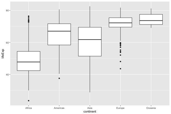
gapminder data life expectancy for each country and continent over multiple years. Let us make a boxplot of life expectancy across continents. We will first provide the gapminder data frame to ggplot and then specify the aesthetics with aes() function in ggplot2. Inside aes(), we will specify x-axis and y-axis variables. To make the boxplot between continent vs lifeExp, we will use the geom_boxplot() layer in ggplot2.

ggplot(gapminder,aes(x=continent, y=lifeExp))+
      geom_boxplot()

The result is a basic boxplot of liefExp for multiple continents. We can clearly see the trend, which is lower life expectancy for Africas and higher life expectancy for Europe and Oceania.


How To Make Basic Boxplot with Colors?

Let us add colors to the basic boxplot. We can color each continent separately. ggplot2 allows you to color by specifying a variable, here continent. We can use fill argument inside aes() function to color the plot.

ggplot(gapminder,aes(x=continent, y=lifeExp, fill=continent)) +
      geom_boxplot()

How To Make Boxplot with Data Points?

Although the boxplot with colors looks much better than the basic boxplot, we are still not showing the actual data. We are only plotting the summary of the data as boxes. We can add actual data points as an additional layer to the boxplot in ggplot by simply adding the function geom_point().

ggplot(gapminder,aes(x=continent, y=lifeExp, fill=continent)) +
      geom_boxplot()+
      geom_point()

How To Make Boxplot with Data Points and jitter?

Adding geom_point() as additional layer plotted all the data points on a vertical line and it is not that useful since all the points with same life expectancy completely overlaps on each other.

One solution to avoid this and actually visualize the data on boxplot is to randomly jitter data points horizontally. ggplot allows you to do that with geom_jitter() function. One can also control the width of the jitter with width argument and specify transparency of data points with the argument alpha.

ggplot(gapminder,aes(x=continent, y=lifeExp, fill=continent)) +
      geom_boxplot() +
      geom_jitter(width=0.25, alpha=0.5)

Share this:

  • Click to share on Facebook (Opens in new window) Facebook
  • Click to share on X (Opens in new window) X

Related posts:

reorder boxplot RHow To Reorder a Boxplot in R? Hint: Use forcats Customizing Grouped BoxplotHow To Make Grouped Boxplots with ggplot2? How To Highlight Select Data Points with ggplot2 in R? ggplot2 change legend title with guides()How To Change Legend Title in ggplot2?

Filed Under: Boxplots with ggplot, Data Visualization, ggplot2, R, R Tips Tagged With: Boxplots with ggplot, make boxplot in R

Primary Sidebar

Subscribe to Python and R Tips and Learn Data Science

Learn Pandas in Python and Tidyverse in R

Tags

Altair Basic NumPy Book Review Data Science Data Science Books Data Science Resources Data Science Roundup Data Visualization Dimensionality Reduction Dropbox Dropbox Free Space Dropbox Tips Emacs Emacs Tips ggplot2 Linux Commands Linux Tips Mac Os X Tips Maximum Likelihood Estimation in R MLE in R NumPy Pandas Pandas 101 Pandas Dataframe Pandas Data Frame pandas groupby() Pandas select columns Pandas select_dtypes Python Python 3 Python Boxplot Python Tips R rstats R Tips Seaborn Seaborn Boxplot Seaborn Catplot Shell Scripting Sparse Matrix in Python tidy evaluation tidyverse tidyverse 101 Vim Vim Tips

RSS RSS

  • How to convert row names to a column in Pandas
  • How to resize an image with PyTorch
  • Fashion-MNIST data from PyTorch
  • Pandas case_when() with multiple examples
  • An Introduction to Statistical Learning: with Applications in Python Is Here
  • 10 Tips to customize ggplot2 title text
  • 8 Plot types with Matplotlib in Python
  • PCA on S&P 500 Stock Return Data
  • Linear Regression with Matrix Decomposition Methods
  • Numpy’s random choice() function

Copyright © 2025 · Lifestyle Pro on Genesis Framework · WordPress · Log in

Go to mobile version