ggforce, R package extension for ggplot, has got a big upgrade with lot of new functions. ggforce was introduced about to years ago with the aim to provide missing functionalities in ggplot2. ggforce provides a
a repository of geoms, stats, etc. that are as well documented and implemented as the official ones found in ggplot2.
The new version of ggforce has a number of new functionalities that will for sure “Accelerate ggplot2”. Finally, had a chance to play with ggforce. Here are some examples of three (of many) interesting features of ggforce.
You can install the released version of ggforce from CRAN with:
install.packages("ggforce")
And the development version from GitHub with:
# install.packages("devtools")
devtools::install_github("thomasp85/ggforce")
ggforce now has a website at https://ggforce.data-imaginist.com, with full documentation overview.
Annotating the plots you make is great way to make a plot easy to grasp. ggplot2 has functions like geom_text() and geom_label() to help annotating the data visualized using ggplot2. But, it is not exaggeration to say that it is not that easy to get it right. The new ggforce offers a set of geoms – geom_mark_*(), that makes it “easy to draw attention to, and describe, features of the plot. They all work in the same way, but differ in the way they enclose the area you want to draw attention to”
The 4 different geoms for annotating data on plots are:
- geom_mark_rect() encloses the data in the smallest enclosing rectangle]
- geom_mark_circle() encloses the data in the smallest enclosing circle
- geom_mark_ellipse() encloses the data in the smallest enclosing ellipse
- geom_mark_hull() encloses the data with a concave or convex hull
Let us see a quick example on how to use geom_mark_ellipse() on gapminder data set.
data_url = 'http://bit.ly/2cLzoxH'
gapminder = read_csv(data_url)
head(gapminder, n=3)
Let us first filter the gapminder data set to contain data for Africa and Europe for the year 2007.
gapminder_2007 <- gapminder %>%
  filter(continent %in% c('Africa', 'Europe')) %>%
  filter(year == 2007)
Let us first write the part of code to make a scatter plot between two variables, gdpPercap and lifeExp, with log scale on x-axis and store it in a variable “sc_plot”. So far this is exactly like plotting a scatterplot with ggplot2.
sc_plot <- gapminder_2007 %>%
 ggplot(aes(x=gdpPercap, lifeExp)) +
 geom_point() +
 scale_x_log10()
Now, we can add ggforce’s new function geom_mark_ellipse() with argument to fill color based on continent.
sc_plot + geom_mark_ellipse(aes(fill = continent))
Now we have annotated our ggplot with an ellipse. One can use other geom_mark_*() functions to annotate with different shapes.

In addition to annotating all the groups in our data, ggforce can also annotate selectively.
Basically, within geom_mark_*() functions we can select specific data points using filtering operation and annotate just those data, not all data in the plot.
# brief description to highlight data points
desc <- 'Europe has higher life expectancy'
# select data points to annotate using filter within geom_mark_ellipse()
gapminder_2007 %>%
  ggplot(aes(x=gdpPercap, lifeExp)) +
  geom_point() +
  scale_x_log10() + theme_bw(base_size = 16) +
  geom_mark_ellipse(aes(filter = continent == 'Europe', label = 'Europe',
                        description = desc))
Here we have highlighted only European countries with an ellipse and a short text annotating what is special about those data points.

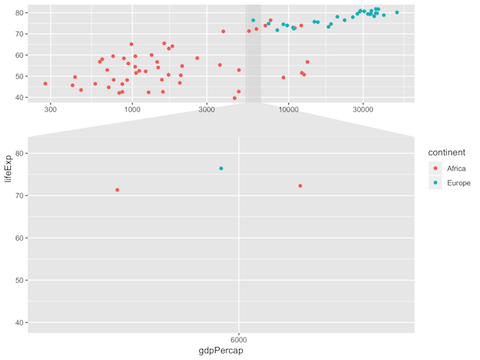
Isn’t that nice? Another new feature that is cool is ability to zoom into a plot made with ggplot2. Typically, to get the zoom-in view, one needs to manually limit the x-axis or y-axis values to show the data points of interest in a separate plot. Now with ggforce’s new function facet_zoom, one can create zoomed-in plots very easily. Here is an example of making a plot with zoom.
We will write the main plotting code like before and add the new layer facet_zoom(). With in facet_zoom(), we can specify which region of the plot that we want to zoom in. Here, we specify the condition for x-axis value to be equal to a specific country.
gapminder_2007 %>%
  ggplot(aes(x=gdpPercap, lifeExp)) +
  geom_point(aes(color=continent))+
  scale_x_log10()+
  facet_zoom(x = country == "Albania")
We we can see zoomed in view for specific x-axis value. Here we zoom-in on an European country that has low gdPercap compared to other European countries. We can also zoom in on y-axis or both x & y-axis.