• Skip to secondary menu
  • Skip to main content
  • Skip to primary sidebar

Python and R Tips

Learn Data Science with Python and R

  • Home
  • Python
  • Pandas
    • Pandas 101
  • tidyverse
    • tidyverse 101
  • R
  • Linux
  • Conferences
  • Python Books
  • About
    • Privacy Policy
You are here: Home / Data Science / Data Science Books / R Graphics Cookbook Second Edition is Available for Free

R Graphics Cookbook Second Edition is Available for Free

April 29, 2019 by cmdlinetips

Winston Chang's R Graphics Cookbook 2nd Edition
Winston Chang’s R Graphics Cookbook 2nd Edition

Winston Chang from RStudio quietly announced last week that the second edition of his popular R Graphics Cookbook: Practical Recipes for Visualizing Data is available now to buy.

Not just that, the book is also available online for free at https://r-graphics.org/.

Winston Chang’s first edition of R Graphics Cookbook was the first R book I got. The book and its online resource http://cookbook-r.com/ have been a fantastic resource for solving nitty-gritty details while making statistical visualization with ggplot, even now. Yes, it is about five years old. Yes, that was before tidyverse became the thing. Yes, it has solutions with qplot, ddply, and so on. Still very useful for a lot ggplot questions.

Always wondered if there is a second edition for it and here it is. Can’t wait to dig through the second edition of R Graphics Cookbook.

If you don’t know about R Graphics Cookbook,

it is a practical guide that provides more than 150 recipes to help you generate high-quality graphs quickly, without having to comb through all the details of R’s graphing systems. Each recipe tackles a specific problem with a solution you can apply to your own project, and includes a discussion of how and why the recipe works.

Yes, it is tidyverse proofed 🙂 It is worth the buy, even if one has the first edition.

In the spirit of the awesome R Graphics Cookbook, let us try a simple plotting example of making awesome plot using R Graphics cookbook’s recipe 🙂

How to Make a Plot with User Defined Functions with ggplot2?

Let us first load tidyverse.

library(tidyverse)

Let us say we have a function that computes something and we want to plot the output of the function for each of the input.

In the example the user defined function is a simple function that computes the square of a number.

# function computing cubed
my_fun <- function(x){
    x^2
}

We can plot the user defined function with stat_function and use the function as argument to it. And we supply input to the function using data frame with single column.

# use stat_function to plot 
ggplot(data.frame(x = c(-10, 10)), aes(x = x)) +
  stat_function(fun = my_fun) + theme_bw()  

We get a nice parabola as we intended.
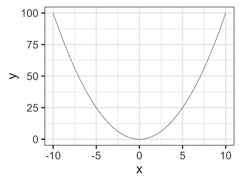
Plotting User Defined Function with ggplot

Now get over to https://r-graphics.org/ to read online or to Amazon to get a physical copy.

Share this:

  • Click to share on Facebook (Opens in new window) Facebook
  • Click to share on X (Opens in new window) X

Related posts:

Default Thumbnail6 Free Books to Learn Python for Data Science Default ThumbnailFree R Books Online for Beginners Default ThumbnailPublication Quality Graphics in #rstats R Books/Resources for Data Science21 Free Online Books to Learn R and Data Science

Filed Under: Data Science Books, R, R Graphics Cookbook, R Graphics Cookbook 2nd Edition Tagged With: Data Science Book, R Graphics Cookbook, R Graphics Cookbook 2nd Edition

Primary Sidebar

Subscribe to Python and R Tips and Learn Data Science

Learn Pandas in Python and Tidyverse in R

Tags

Altair Basic NumPy Book Review Data Science Data Science Books Data Science Resources Data Science Roundup Data Visualization Dimensionality Reduction Dropbox Dropbox Free Space Dropbox Tips Emacs Emacs Tips ggplot2 Linux Commands Linux Tips Mac Os X Tips Maximum Likelihood Estimation in R MLE in R NumPy Pandas Pandas 101 Pandas Dataframe Pandas Data Frame pandas groupby() Pandas select columns Pandas select_dtypes Python Python 3 Python Boxplot Python Tips R rstats R Tips Seaborn Seaborn Boxplot Seaborn Catplot Shell Scripting Sparse Matrix in Python tidy evaluation tidyverse tidyverse 101 Vim Vim Tips

RSS RSS

  • How to convert row names to a column in Pandas
  • How to resize an image with PyTorch
  • Fashion-MNIST data from PyTorch
  • Pandas case_when() with multiple examples
  • An Introduction to Statistical Learning: with Applications in Python Is Here
  • 10 Tips to customize ggplot2 title text
  • 8 Plot types with Matplotlib in Python
  • PCA on S&P 500 Stock Return Data
  • Linear Regression with Matrix Decomposition Methods
  • Numpy’s random choice() function

Copyright © 2025 · Lifestyle Pro on Genesis Framework · WordPress · Log in

Go to mobile version