Let us first load the packages needed, we will mainly be using dplyr and ggplot2 here.
library(dplyr)
library(ggplot2)
theme_set(theme_bw(base_size = 16))
Let us use the gapminder data from Carpentries website to make plots and highlight data points.
data_url = 'http://bit.ly/2cLzoxH'
gapminder = read_csv(data_url)
## Parsed with column specification:
## cols(
##   country = col_character(),
##   year = col_integer(),
##   pop = col_double(),
##   continent = col_character(),
##   lifeExp = col_double(),
##   gdpPercap = col_double()
## )
This is how our gapminder data looks like.
head(gapminder, n=3)

## # A tibble: 3 x 6
##   country      year      pop continent lifeExp gdpPercap
##   <chr>       <int>    <dbl> <chr>       <dbl>     <dbl>
## 1 Afghanistan  1952  8425333 Asia         28.8      779.
## 2 Afghanistan  1957  9240934 Asia         30.3      821.
## 3 Afghanistan  1962 10267083 Asia         32.0      853.
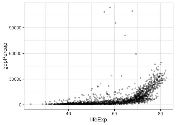
Let us use the data to make a simple scatter plot using ggplot. Let us plot lifeExp on x-axis and gdpPercap on y-axis. Since there are a lot of overlapping data points, let us set the transparency level to 0.3.
gapminder %>%
  ggplot(aes(x=lifeExp,y=gdpPercap)) +
  geom_point(alpha=0.3)
A quick look at the plot suggests the gdpPercap outliers on y-axis squishes the ploints on y-axis a lot. It is natural to seek out more information on the outliers. Also, we probably need to change the y-axis to log-scale to spread out the datapoints on y-axis.
Let us highlight the outlier data points in red using ggplot2. The way to do it is, we first make the scatter plot normally as we did before. And then create a new dataframe containing only the data points we need to highlight. Here we can use filter function to create a new dataframe from gapminder data.
# filter dataframe to get data to be highligheted
highlight_df <- gapminder %>%
             filter(gdpPercap>=59000)
We can use the new data frame containing the data points to be highlighted to add another layer of geom_point().
gapminder %>%
  ggplot(aes(x=lifeExp,y=gdpPercap)) +
  geom_point(alpha=0.3) +
  geom_point(data=highlight_df,
             aes(x=lifeExp,y=gdpPercap),
             color='red',
             size=3)
Note that we have two geom_point(), one for all the data and the other for with data only for the data to be highlighted. And in the second geom_point(), we use the new dataframe, not the original data frame. We can see that the data points above 59k for gdpPercap is highlighted in red.

We can also highlight by a variable/column in the dataframe to learn more about the highlighted data points. Let us color the highlighted data points by country.
gapminder %>%
  ggplot(aes(x=lifeExp,y=gdpPercap)) +
  geom_point(alpha=0.3) +
  geom_point(data=highlight_df,
             aes(x=lifeExp,y=gdpPercap, color=country),size=3)
We can see that all the highlighted points are from the country Kuwait.

In summary, we saw examples of using ggplot2 to highlight certain data points of interest in a scatter plot. We created a new data frame from the original dataframe to select the data points of interest and used it with geom_point() to add it as another to layer to the plot.


