Barplots or barcharts are extremely handy visualization technique for a variety of situations. It is of great use when you have multiple of categories and quickly visualize the counts of each category.
In this post, we will start with how to make simple barplots using ggplot2 in R. Then we will see many examples of making a bar plot or bar chart looking better using R so that we can gain the most from the barplots.
Let us load tidyverse and set the ggplot theme for making our plots.
library(tidyverse)
theme_set(theme_bw())
We will use data set on the on the number of PhDs in different fields over the year from NSF. This dataset from NSF is cleaned and available from R4DS Online Learning Community’s #TidyTuesday project. It is a treasure trove of interesting data sets.
We will load the dataset directly from the rfordatascience github page.
phd_field <- readr::read_csv("https://raw.githubusercontent.com/rfordatascience/tidytuesday/master/data/2019/2019-02-19/phd_by_field.csv")
## Parsed with column specification:
## cols(
##   broad_field = col_character(),
##   major_field = col_character(),
##   field = col_character(),
##   year = col_double(),
##   n_phds = col_double()
## )
The dataframe has 5 columns describing the broad field and the number of PhDs awarded from year 2008 to 2017.
## # A tibble: 6 x 5
##   broad_field  major_field               field                  year n_phds
##   <chr>        <chr>                     <chr>                 <dbl>  <dbl>
## 1 Life scienc… Agricultural sciences an… Agricultural economi…  2008    111
## 2 Life scienc… Agricultural sciences an… Agricultural and hor…  2008     28
## 3 Life scienc… Agricultural sciences an… Agricultural animal …  2008      3
## 4 Life scienc… Agricultural sciences an… Agronomy and crop sc…  2008     68
## 5 Life scienc… Agricultural sciences an… Animal nutrition       2008     41
## 6 Life scienc… Agricultural sciences an… Animal science, poul…  2008     18
For the first set of barplots, let us summarize the data such that we have total number of PhDs granted per broad field. Bascially, we are collapsing over the variable year by summing over all years.
phd_df1 <- phd_field %>%
  group_by(broad_field) %>%
  summarise(n=sum(n_phds, na.rm=TRUE))
Now we have a tibble with broad field and total number of PhDs awarded. Let us go ahead and make simple barplots using ggplot2 in R.
In ggplot2, we can make barplots in two ways. We can use geom_col() to make plots and we can also use geom_bar() to barcharts.
1. How to Make a Simple Barplot?
Let us see how can we use geom_col() to make barplots. geom_col() uses the values in the data to represent the height of bars, which is want we wanted here.
So we specify, x and y-axis variable and simply add geom_col() as another layer.
phd_df1 %>%
  ggplot(aes(x=broad_field, y=n))+
  geom_col()
Voila, we have made our first bar plot with broad field on x-axis and the number of PhDs on y-axis. There are a number of things that does not look right in our first barplot. We will fix them in the next steps.


2. How to make barplots with geom_bar?
geom_bar() is another way to make barplots using ggplot2 in R. Describing the difference between geom_bar() and geom_col() tidyverse doc says
geom_bar() makes the height of the bar proportional to the number of cases in each group (or if the weight aesthetic is supplied, the sum of the weights). If you want the heights of the bars to represent values in the data, use geom_col() instead. geom_bar() uses stat_count() by default: it counts the number of cases at each x position. geom_col() uses stat_identity(): it leaves the data as is.
phd_df1 %>%
  ggplot(aes(x=broad_field, y=n))+
  geom_bar(stat="identity")

3. How to flip barplot’s axes?
In the above barplots, x-axis label completely overlaps with each other and thus make it difficult read them clearly. A solution is to swap x and y-axes. In ggplot2, we can flip the axes using coord_flip() function.
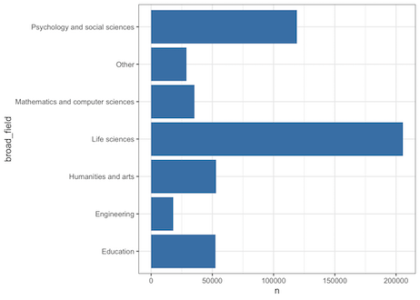
phd_df1 %>%
  ggplot(aes(x=broad_field, y=n))+
  geom_col() +
  coord_flip()
Adding coord_flip() as another layer, now we have broad_field on y-axis and easy to read.

4. How to change the color of bars in barplot?
We can colors to the barplot in a few ways. If we want to manually specify a color for the bars, we can specify the available color names as fill.
phd_df1 %>%
  ggplot(aes(x=broad_field,y=n)) +
  geom_col(fill="steelblue") +
  coord_flip()
Here we use “steelblue” to fill the bars in barplot.
5. How to change the color of bars in barplot using a variable?
We can also color the bars of barplot using another variable in the data set. That variable can either be quantitative or categorical in nature.
Here we color each bar using a quantitative variable in our data, i.e. the total number of PhDs awarded.
phd_df1 %>%
  ggplot(aes(x=broad_field, y=n, fill=n))+
  geom_col() +
  coord_flip()
When we color by a variable, we get a legend describing the colors. In this example, we have legend describing the range of the variable and the corresponding color.

6. How to reorder bars in barplot plot?
One of the issues with the above barplots is that it is not ordered and thus making it difficult to intepret.
We can reorder the bars based on values of other variables using the reorder() function. Here we reorder the x-axis based on the values of n, the number of PhDs awarded.
# reordering bars in barplot
phd_df1 %>%
  ggplot(aes(x=reorder(broad_field, n), y=n))+
  geom_col(fill="steelblue") +
  xlab("broad_field") +
  coord_flip()
Now our barplot is reordered, with the field with largest number of PhDs on top and the lowest at the bottom.

7. How to make barplots using top n values of a variable?
Sometimes you have a large number of groups and like to order the barplots but show only the top variables.
In our example data set, the number of fields (sub category of broad field) is high and would like to visualize the top fields in order.
To do that we can sort the field variable by its count and get the top n rows to make barplots.
phd_field %>%
  group_by(broad_field,field) %>%
  summarise(n=sum(n_phds, na.rm=TRUE)) %>%
  arrange(desc(n))%>%
  head(30)%>%
  ggplot(aes(x=reorder(field,n),y=n, fill=broad_field)) +
  xlab("field")+
  geom_col() + coord_flip()
Since we whave two variables of interest, both broad field and field, we can visualize the bars by coloring it by broad field.

8. How to make grouped barplots?
When you have multiple groups, you can make grouped barplots to visualize the counts from multiple groups.
In our example, we have data from multiple years and here is how to make grouped barplots showing just two subgroups per field.
We use the “fill” inside aes() argument with the grouping variable to make grouped barplots.
phd_field %>%
  filter(year %in% c(2008,2017)) %>%
  group_by(broad_field,year,field) %>%
  summarise(n=sum(n_phds, na.rm=TRUE)) %>%
  arrange(desc(n))%>%
  head(20)%>%
  ggplot(aes(x=reorder(field,n),y=n, fill=factor(year))) +
  xlab("field")+
  geom_col(position='dodge') + coord_flip()


