

Scatter plot is one of the common data visualization method used to understand the relationship between two quantitative variables. When there is strong association between two variables you would easily see the relationship with scatterplot. However, when the relationship is subtle it may be tricky to see it.
In this post we will see 9 tips to make a better a scatter plot with ggplot2 in R to help us understand the relationship between two quantitative variables.
Let us load tidyverse and set our ggplot theme to theme_bw(). Unofficially, changing ggplot2’s default grey theme is the first trick to make you ggplot2 look nicer ;-).
library(tidyverse)
theme_set(theme_bw())
Let us use augmented gapminder data for our illustrations. The augmented gapminder data contains extra variable on CO2 emission per each country.
co2_data <- "https://raw.githubusercontent.com/cmdlinetips/data/master/gapminder_data_with_co2_emission.tsv"
# load the tsv as data frame
gapminder_co2 <- read_tsv(co2_data)
We can see that in addition to six variables from gapminder data set we also have CO2 emission values.
## Parsed with column specification:
## cols(
##   country = col_character(),
##   year = col_double(),
##   co2 = col_double(),
##   continent = col_character(),
##   lifeExp = col_double(),
##   pop = col_double(),
##   gdpPercap = col_double()
## )
Scatter Plot with ggplot2
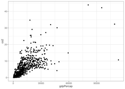
Let us first make a simple scatter plot using ggplot2 in R. Here we will use gdpPercap on x-axis and co2-emission on y-axis.
The way to make scatterplot with ggplot2 is simple. We will feed the data frame to ggplot2 using pipe operator and specify aesthetics of the scatter plot using aes(). The basic aesthetics of scatter plot is specifying the variables to be plotted as scatter plot, i.e. x-axis and y-axis variables.
After we specify the variables for scatter plot, we add a geom_() layer for scatter plot. The geom_() function for scatter plot is geom_point() as we visualize the data points as points in a scatter plot.
gapminder_co2 %>%
  ggplot(aes(x=gdpPercap,y=co2)) +
  geom_point()
Now we have made our first scatter plot with gdpPercap on x-axis and CO2 emission on y-axis. A couple of things strike at first when look at the scatter plot.
First is that we do see linear trend between the variables. However, that trend seems to be dominated by the outlier data points. Another thing to notice that is x-axis and y-axis labels and ticks seem bit tiny when compared to the rest of the scatter plot.
Scatter Plot tip 1: Add legible labels and title
Let us specify labels for x and y-axis. And in addition, let us add a title that briefly describes the scatter plot. We can do all that using labs(). To make the labels and the tick mark labels more legible we use theme_bw() with base_size=16.
gapminder_co2 %>%
  ggplot(aes(x=gdpPercap,y=co2)) +
  geom_point() +
  labs(x="GDP per capita", y= "CO2 Emission per person (in tonnes)",
       title="CO2 emission per person vs GDP per capita")+
  theme_bw(base_size = 16)
Now the scatter plot looks definitely better than our first attempt.

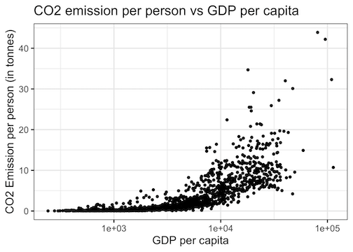
Scatter Plot tip 2: Log scale on x-axis
Notice that the scales of the two variables are very different and there are more data points squished towards left because of few outlier data points. One of the ways to make the plot better is to make the plot with log scale. This is often one of the best tips to make plot better and understand the relationship between two variables.
Let us first make the variable on x-axis to log scale. In ggplot2, we can easily make x-axis to be on log scale using scale_x_log10() function as an additional layer.
gapminder_co2 %>%
  ggplot(aes(x=gdpPercap,y=co2)) +
  geom_point() +
  labs(x="GDP per capita", y= "CO2 Emission per person (in tonnes)",
       title="CO2 emission per person vs GDP per capita") +
  scale_x_log10()
The scatter plot looks very different. On x-axis the data points are clearly spread out. However, the plot is dominated by the outliers from variable on y-axis.
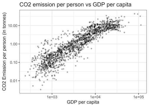
Scatter Plot tips: Log scale on x-axis and y-axis
We can see that the variable on y-axis squished near zero. In this plot the variable on y-axis also needs to be on log scale. We can make the variable on y-axis to be on log scale using scale_y_log10().
gapminder_co2 %>%
  ggplot(aes(x=gdpPercap,y=co2)) +
  geom_point() +
  labs(x="GDP per capita", y= "CO2 Emission per person (in tonnes)",
       title="CO2 emission per person vs GDP per capita") +
  scale_y_log10()+
  scale_x_log10()
Now the scatter plot made by ggplot2 looks much better. We can clearly see the linear relationship between gdpPercap and CO2, which was not clear until now.

Scatter Plot tip 3: Transparency with alpha
One of the problems while plotting many data points is overcrowding of data points on the scatter plot. Basically, multiple data points with similar values overlap on each other and obscure the number of data points on scatter plot.
A solution to overcrowding is to add transparency/opaque level for each data point. We can specify the percent transparency using alpha parameter with geom_point().
gapminder_co2 %>%
  ggplot(aes(x=gdpPercap,y=co2)) +
  geom_point(alpha=0.3) +
  labs(x="GDP per capita", y= "CO2 Emission per person (in tonnes)",
       title="CO2 emission per person vs GDP per capita") +
  scale_y_log10()+
  scale_x_log10()
In our example, we can clearly see that the transparency level has addressed the overcrowding of data points. Play with adjusting alpha values to 0.1 to 0.9 to find a suitable transparency level.
Scatter Plot tip 4: Add colors to data points by variable
Basic scatter plots reveal relationship between tow variables. Often, your data might contain other variables in addition to the two variables. Often we would like to visualize the third or fourth variables relation with the two main variables on the scatter plot. One of the ways we can bring an additional variable is to color the data points based on the value of the third variable.
For example, in our gapminder data another variable of interest is continent. We can color each data point based which continent it is from. We can color data points using a variable by adding color=continent to the aesthetics aes() inside ggplot().
gapminder_co2 %>%
  ggplot(aes(x=gdpPercap,y=co2, color=continent)) +
  geom_point(alpha=0.5) +
  labs(x="GDP per capita", y= "CO2 Emission per person (in tonnes)",
       title="CO2 emission per person vs GDP per capita") +
  scale_y_log10()+
  scale_x_log10()
Now our data points have different colors depending on which continent it is from. We can clearly see that data points from African countries have smaller gdpPercap/CO2 emission, compared to European countries.
By default ggplot2 adds a legend for third variable we used to color data points. The legend maps the color to the continent value.

Scatter Plot tip 5: Add size to data points by variable
Sometimes we may have fourth variable of interest in our data and we would like to differentiate that in our scatter plot. One way to add the fourth variable is to give different size for data points based on the values of the variable of interest. We can specify the variable to show different size using size variable.
In our example, we want to add the population as size variable using size=pop within the aesthetics function aes().
gapminder_co2 %>%
  ggplot(aes(x=gdpPercap,y=co2)) +
  geom_point(alpha=0.5, aes(color=continent,size=pop)) +
  labs(x="GDP per capita", y= "CO2 Emission per person (in tonnes)",
       title="CO2 emission per person vs GDP per capita") +
  scale_y_log10()+
  scale_x_log10()
The scatter with size option highlights the data points with larger population with bigger circles.

We can also differentiate another variable using different shapes with shape argument with aes(). Note that when the number of levels of variable is tool big, these color/shape option may not work.
Scatter Plot tip 6: Linear model with geom_smooth()
In our example, we clearly see a linear trend between the two variables. However, often you might be working with data set the linear relation may be subtle. One effective way to see if there is a linear trend and visualize that with scatter plot is to add results from statistical model.
In ggplot2, we have geom_smooth() function that lets you add line from linear model with confidence interval.
gapminder_co2 %>%
  ggplot(aes(x=gdpPercap,y=co2)) +
  geom_point(alpha=0.5, aes(color=continent,size=pop)) +
  labs(x="GDP per capita", y= "CO2 Emission per person (in tonnes)",
       title="CO2 emission per person vs GDP per capita") +
  scale_y_log10()+
  scale_x_log10()+
  geom_smooth(method=lm,se=FALSE)
We can see that geom_smooth() has added a blue line from linear model using all of the data. The line clearly show the linear trend that we already know. In our example, we use linear model using “lm” without showing confidence interval band.


Scatter Plot tip 7: Linear model per group
In the previous example, we used geom_smooth() on all the data and made a single linear fit. However, when you have multiple groups in the data, you might want to build group specific linear fit and display the line per group.
In our example, we have data from multiple continents and we can perform linear fit per continent and display the fitted line for each continent. The trick to add geom_smooth() line per group is to specify the grouping variables “color=continent,size=pop” inside aesthetics containing x and y-axis variables. Compare the code chunk below with one above,
gapminder_co2 %>%
  ggplot(aes(x=gdpPercap,y=co2,color=continent,size=pop)) +
  geom_point(alpha=0.5) +
  labs(x="GDP per capita", y= "CO2 Emission per person (in tonnes)",
       title="CO2 emission per person vs GDP per capita") +
  scale_y_log10()+
  scale_x_log10()+
  geom_smooth(method=lm,se=FALSE)
Now we have a linear model with geom_smooth() and added lines for each group. It clearly show the relationship between gdpPercap and CO2 emission varies between the continents.

Scatter Plot tip 8: Annotate with text
Another useful tip to make a scatter plot better is to add text annotations. The ggrepel package supports adding text annotations on a plot made with ggplot2.
We might want to highlight specific data points with its attribute of interest. For example, in the scatterplot we are working with, we might to add the name of countries that are on the extremes, i.e. lower gdpPercap & CO2 emission and the countries with higher gdpPercap & CO2 emission values.
We first subset our original data frame to contain just the data points that we want to annotate. Then we use ggrepel’s geom_text_repel() function with the subsetted data (not the original data frame) and we specify which variable we wan to use to annotate the scatter plot within aes().
set.seed(143)
gapminder_co2 %>%
  ggplot(aes(x=gdpPercap,y=co2)) +
  geom_point(alpha=0.5, aes(color=continent,size=pop)) +
  labs(x="GDP per capita", y= "CO2 Emission per person (in tonnes)",
       title="CO2 emission per person vs GDP per capita") +
  scale_y_log10()+
  scale_x_log10()+
  geom_smooth(method=lm,se=FALSE) +
  ggrepel::geom_text_repel(data = gapminder_co2 %>%
                             filter(gdpPercap>12000  | gdpPercap < 1000) %>%
                             sample_n(20),
                           aes(label = country))

Scatter Plot tip 9: facets (small multiples)
When you are making a scatter plot(or any plot) with multiple variables and want to visualize those variables, one of the ways to do that is to use tip 7 that highlights multiple groups all in one plot. However, with more variables a scatter plot highlighting multiple groups will be very difficult to interpret.
A better tip when dealing with multiple variables is to use Edward Tufte’s idea of “small multiples”. According to Tufte
At the heart of quantitative reasoning is a single question: Compared to what? Small multiple designs, multivariate and data bountiful, answer directly by visually enforcing comparisons of changes, of the differences among objects, of the scope of alternatives. For a wide range of problems in data presentation, small multiples are the best design solution.
Thanks to ggplot2, making a plot showcasing multiple variables separately as small multiples is really easy. ggplot2’s facet-ing option makes it super easy to make great looking small multiples.
In our example, we simply add another layer using one of the facet functions facet_wrap() by specifying the variable we want to make a plot on its own. Here we are making a scatter plot with linear fit for each continent.
gapminder_co2 %>%
  filter(continent!="Oceania") %>%
  ggplot(aes(x=gdpPercap,y=co2,color=continent,size=pop)) +
  geom_point(alpha=0.3) +
  labs(x="GDP per capita", y= "CO2 Emission per person (in tonnes)",
       title="CO2 emission \n per person vs GDP per capita") +
  scale_y_log10()+
  scale_x_log10()+
  geom_smooth(method=lm,se=FALSE)+
  facet_wrap(~continent, ncol=2)+
  theme_bw(base_size = 16)
Here is the result of using faceting with facet_wrap() on continent variable. Here we only show four continents with two columns grid. Note the x and y-axis ranges in all plots are the same and thus make it easier to compare across plots.

Scatter Plot tips: Customizing facets (small multiples)
By default, when we use faceting with facet_wrap(), ggplot2 uses grey box to describe each plot with a default font size and color. We can easily customize facet plots using theme() function.
We can customize the text in title box using strip.text.x argument. We can change the color of title box in facet plot with strip.background argument.
gapminder_co2 %>%
  filter(continent!="Oceania") %>%
  ggplot(aes(x=gdpPercap,y=co2,color=continent,size=pop)) +
  geom_point(alpha=0.3) +
  labs(x="GDP per capita", y= "CO2 Emission per person (in tonnes)",
       title="CO2 emission per \n person vs GDP per capita") +
  scale_y_log10()+
  scale_x_log10()+
  geom_smooth(method=lm,se=FALSE)+
  facet_wrap(~continent, ncol=2)+
  theme(strip.text.x = element_text(size=12, color="blue",angle=0),
          strip.background = element_rect(colour="blue", fill="white"),
        axis.text = element_text(size=12))
Here is how the customized facet scatter plot with different background and font size.

To summarize, we have seen 9 best tips to make a better scatter plots using ggplot2 in R. You can see how much difference the tips have made by looking at the simple scatter plot that we started with and final scatter plot tips with faceting. Although we used these tips to make better scatter plots, we can use the same tips on other plots with ggplot2. To close, let us end this post with a bonus tip. Yes, we made best looking scatter plot using the 9 tips, but it will be go waste if we did not save them as an image file with right resolution. It is really easy to save the plot you made with ggsave() function in ggplot2.
Let us say you have made the best looking scatter plot and immediately after that use ggsave() with the following options.
we specify the name file with png as extension, specify width and height of the plot we want and we can also specify resolution of the plot with dpi.
ggsave("best_looking_scatter_plot_with_ggplot2.png",
        width = 8, height = 8, dpi = 300)


