Linear Regression is one of the most commonly used statistical methods. Linear modeling and Linear regression helps us understand the relationship between multiple variables. In the simplest case, linear regression is about understanding the relation between two variables, X and Y.
One of the ways to understand linear regression is that we have the observed data (X,Y) pair and model it as a linear model of this form
Y = a + bX,
where X is the explanatory variable and Y is the dependent variable. With just two variables the linear model simply specifies a line. The slope of the line is b, and a is the intercept (the value of y when x = 0).
We fit a linear equation i.e. find the line that best explains the observed data.
Let us load tidyverse and set gggplot theme to theme_bw()
library(tidyverse)
theme_set(theme_bw())
To illustrate how to perform linear regression analysis in R, we will use simulated data based on lifeExp values from gapminder dataset. Let us load gapminder data set.
library(gapminder)
head(gapminder)
## # A tibble: 6 x 6
##   country     continent  year lifeExp      pop gdpPercap
##   <fct>       <fct>     <int>   <dbl>    <int>     <dbl>
## 1 Afghanistan Asia       1952    28.8  8425333      779.
## 2 Afghanistan Asia       1957    30.3  9240934      821.
## 3 Afghanistan Asia       1962    32.0 10267083      853.
## 4 Afghanistan Asia       1967    34.0 11537966      836.
## 5 Afghanistan Asia       1972    36.1 13079460      740.
## 6 Afghanistan Asia       1977    38.4 14880372      786.
Let us randomly select 200 lifeExp values from gapminder data and we will use that for our X variable.
set.seed(42)
X <- gapminder %>%
  sample_n(200) %>%
  pull(lifeExp)
Let us create the variable Y based on X, by adding random noise. We use random numbers sampled from normal distribution with mean 5 and sd 2.
set.seed(42)
random_noise <- rnorm(length(X), mean=5, sd=2)
Let us make a histogram to see the distribution of the noise centered around 5.
ggplot(mapping = aes(random_noise))+
  geom_histogram(bins=50, fill="steelblue", col="black")
Let us create Y by adding the random noise to X values and create a data frame to keep both X and Y.
Y <- X + random_noise
df_lm <- data.frame(X=X,Y=Y)
head(df_lm)

##        X        Y
## 1 52.644 60.38592
## 2 57.939 61.80960
## 3 55.191 60.91726
## 4 72.220 78.48573
## 5 71.100 76.90854
## 6 54.043 58.83075


Now, we have the data and ready to do linear regression analysis with R. We can fit a linear model in R with lm() function. To do linear regression with Y and X and save the result in a variable.
# fit linear regression
lm_obj <- lm(Y~X)
We can get the summary of the linear model using the function summary()
# summary
summary(lm_obj)
Summary of the linear model provides a lot of information about the linear model and it would like this.
##
## Call:
## lm(formula = Y ~ X)
##
## Residuals:
##     Min      1Q  Median      3Q     Max
## -5.8580 -1.1346 -0.0774  1.2124  5.2405
##
## Coefficients:
##             Estimate Std. Error t value Pr(>|t|)
## (Intercept)  5.75676    0.64238   8.962  2.4e-16 ***
## X            0.98634    0.01056  93.391  < 2e-16 ***
## ---
## Signif. codes:  0 '***' 0.001 '**' 0.01 '*' 0.05 '.' 0.1 ' ' 1
##
## Residual standard error: 1.946 on 198 degrees of freedom
## Multiple R-squared:  0.9778, Adjusted R-squared:  0.9777
## F-statistic:  8722 on 1 and 198 DF,  p-value: < 2.2e-16
First, it will provide the linear model formula and a lot of details about the linear model we just built.
Let us just to section with the title “Coefficients” and look at the column variable “Estimate”. It gives the two parameters of the linear model, the intercept a and the slope b, estimated from the data points.
In this example, intercept a = 5.75676 and the slope is 0.98634.
Another parameter of interest is Adjusted R-squared given at the bottom. Adjusted R-squared is a measure of how well the data fits to the linear model. You can also think of it as measure of correlation between the two variables. It tells us the how much variance in the variable Y is explained by the variable X.
There are a lot of other features in the summary of the model. We will not worry about that now.
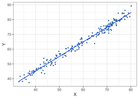
Now that we know the variables X and Y in this examples are highly correlated and linear regression model fits the data nicely.
Let us make a scatter plot between X and Y to see the relationship between X and Y. Let us also add fit line using geom_smooth() function using the linear model to see the fit.
df_lm %>%
  ggplot(aes(x=X,y=Y)) +
  geom_point(color="steelblue") +
  geom_smooth(method='lm',se=FALSE) +
  theme_bw(base_size = 16)
We can see that, X and Y are highly correlated to each other.
Second Linear Regression Example
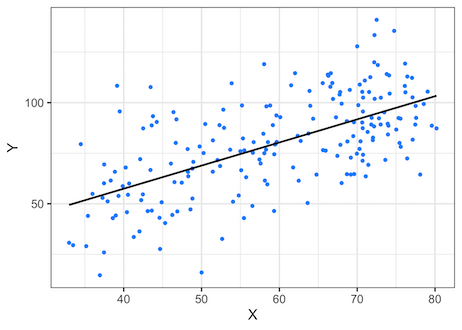
Now let us try doing linear regression in R with two variables that are not that correlated that much.
Let us generate random noise again, but this time with mean 20 and a larger standard deviation 20.
random_noise2 <- rnorm(length(X), mean=20, sd=20)
Let us add the random noise to X and create new variable Y as before.
Y <- X + random_noise2
Let us go ahead build a linear model with the new set of data. A difference in the linear model below is that we also provide the dataframe with the data.
# Create a dataframe
df2_lm <- data.frame(X=X,Y=Y)
# build linear regression model with lm()
lm2_obj <- lm(Y~X,data=df2_lm)
We can look at the summary of the linear model using summary() function as before
summary(lm2_obj)
And we would get a detailed summary as seen before. Our linear regression model has estimated the parameter for intercept a= 11.7267 and intercept b=1.1431.
If we look at the value of Adjusted R-squared = 0.3824, it is much lower when compared to the previous model. However, it still does explain a chunk of variance in the data. We can learn that, there is a linear relationship between the variables X and Y, but it is not as strong as the relationship in the first example.
##
## Call:
## lm(formula = Y ~ X, data = df2_lm)
##
## Residuals:
##     Min      1Q  Median      3Q     Max
## -52.879 -12.664  -1.151  12.560  51.866
##
## Coefficients:
##             Estimate Std. Error t value Pr(>|t|)
## (Intercept)  11.7267     6.2383    1.88   0.0616 .
## X             1.1431     0.1026   11.14   <2e-16 ***
## ---
## Signif. codes:  0 '***' 0.001 '**' 0.01 '*' 0.05 '.' 0.1 ' ' 1
##
## Residual standard error: 18.9 on 198 degrees of freedom
## Multiple R-squared:  0.3855, Adjusted R-squared:  0.3824
## F-statistic: 124.2 on 1 and 198 DF,  p-value: < 2.2e-16
Let us make the scatter plot between the two variables and fit a geom_smooth() function linear model.
df2_lm %>%
  ggplot(aes(x=X,y=Y)) +
  geom_point(color="dodgerblue") +
  theme_bw(base_size=16) +
  geom_smooth(method='lm',se=FALSE, color="black")
By looking at the scatter plot, we can come to the same conclusion that there is a weak linear relationship between the two variables.