

Sometimes you might want to highlight a select data points on a scatter plot. Often when plotting scatter plots you might want to highlight data points in a different color from the rest of the data points. Other times you want to show select data points in different color and annotate them with text.
In this post, we will use matplotlib in Python and see examples of
- How to highlight select data points in a scatter plot with different color?
- How to highlight select data points with different color and annotate with text?
Let us load the packages we need.
import numpy as np
import pandas as pd
import matplotlib.pyplot as plt
We will use gapminder data from Carpentries website. We will load the data into Pandas dataframe by directly reading from the website.
data_url = 'http://bit.ly/2cLzoxH'
# read data from url as pandas dataframe
gapminder = pd.read_csv(data_url)
print(gapminder.head(3))
Let us make a simple scatter plot using matplotlib. We use scatter function in matplotlib to make scatter plot between lifeExp values on x-axis and gdpPercap values on y=axis.
# scatter plot with matplotlib in Python
plt.scatter(gapminder.lifeExp, gapminder.gdpPercap,
    alpha=0.5)
# set x-axis label and specific size
plt.xlabel('lifeExp',size=16)
# set y-axis label and specific size
plt.ylabel('gdpPercap',size=16)
# set plot title with specific size
plt.title('Scatter Plot with Python',size=16)
# save the plot as PNG file with dpi=150
plt.savefig('Scatter_Plot_with_Matplotlib_in_Python.png', dpi=150)
Our scatter plot between life expectancy values and gdpPercap values looks like this. Scales of x and y axes are different and that there are few data points with large gdpPercap values stand out as outliers.
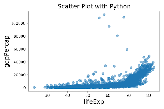
The outlier data points make the scatter plot really intriguing and you might want to highlight the outliers in a different color. Let us highlight the select data points with a specific color that is different from other data points’ color.
To highlight data points, we first need to programmatically identify the outlier data points. We can see that those data points all have gdpPercap values more than 50000 and also lifeExp values greater than 50.
Let us subset our gapminder data set to contain only the select data points and store that in a different data frame. We can use Pandas’ query() function to subset the interesting data points as follows.
df = gapminder.query('gdpPercap >=50000 & lifeExp >50')
Now that we have the data points that we want to highlight in a specific color, we are ready to write code highlight them with matplotlib in Python.
To start with we will first make scatter plot exactly as before between the two variables. Here we have just changed the title of the plot.
# scatter plot with matplotlib in Python
plt.scatter(gapminder.lifeExp, gapminder.gdpPercap,  alpha=0.5)
# set x-axis label and specific size
plt.xlabel('lifeExp',size=16)
# set y-axis label and specific size
plt.ylabel('gdpPercap',size=16)
# set plot title with specific size
plt.title('How To Highlight Data Points with colors \n in Python with matplotlib?',size=16)
Now we can add new layer of scatter plot, but this time only with the specific data points that we want to highlight. We have already subsetted the data points in a new dataframe “df”. We can again use scatter() function, but this time with the data from the subsetted dataframe df. We also specify the color we want, here we specify the color to be red.
plt.scatter(df.lifeExp, df.gdpPercap, color="red")
#plt.show()
plt.savefig('How_To_Highlight_Data_Points_with_Color_Python.png', dpi=150)
Now we have highlighted the select data points, in this case outliers, in red color on a scatter plot.

How to Highlight Data Points with Color and Text in Python?
In the above plot, it may better to actually plot more information about the outliers. For example, it will be good to know the countries of outlier data points that we colored.
Let us repeat the same code as above to highlight the data points using using a subsetted dataframe.
df = gapminder.query('gdpPercap >=50000 & lifeExp >50')
plt.scatter(gapminder.lifeExp, gapminder.gdpPercap,  alpha=0.5)
# set x-axis label and specific size
plt.xlabel('lifeExp',size=16)
# set y-axis label and specific size
plt.ylabel('gdpPercap',size=16)
plt.title('How To Highlight Data with Color and Text \n with matplotlib in Python?',size=14)
plt.scatter(df.lifeExp, df.gdpPercap, color="red")
Then, we need to add the text, here the name of country, for each outlier data points. Matplotlib has a function named annotate() to add text in a specific location in a plot. We need to specify annotate() function the text we want to annotate the plot with and the x and y co-ordinates for the location of the text.
In our example, the text we want to annotate is the name of the country and the x and y coordinates of the text is approximately our lifeExp and gdpPercap values.
Since we have data points to annotate, we need to loop through each data point of interest. Here we use for loop on the select data points and add text to each data point.
# loop through to annotate multiple datapoints
for i in range(df.shape[0]):
    plt.annotate(df.country.tolist()[i], (df.lifeExp.tolist()[i], df.gdpPercap.tolist()[i]))
print(df.shape[0])
plt.tight_layout()
#plt.show()
plt.savefig('How_To_Highlight_Data_Annotate_with_Text_Python.png', dpi=150)
Here is the plot we wanted. We have highlighted the select data points in red and annotated each data point with text, here name of country.


