Let us get started by load tidyverse, the R suite of packages from RStudio and palmerpenguins package for making plots using penguins dataset.
library(tidyverse)
library(palmerpenguins)
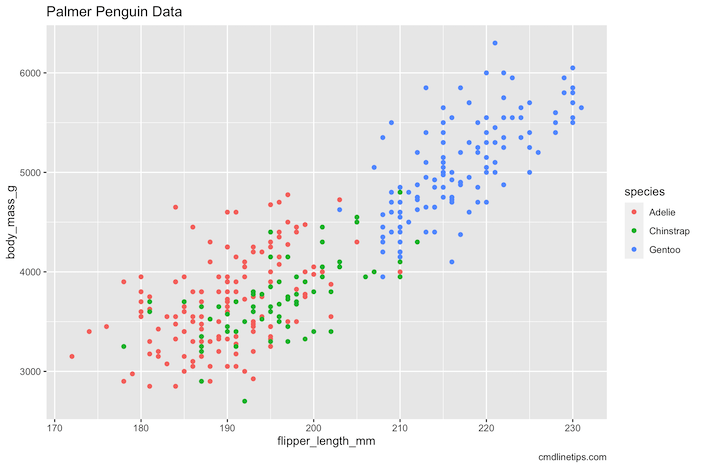
First, let us make a simple scatter plot using ggplot with default theme. We customize the plot minimally by adding title and caption to the plot.
p1 <- penguins %>%
  ggplot(aes(x = flipper_length_mm,
             y = body_mass_g,
             color = species))+
  geom_point()+
  labs(title= "Palmer Penguin Data",
       caption="cmdlinetips.com")
p1
ggplot2’s default background color is grey and it would looks like this.
ggplot2 offers easy way to customize the plot to suit our needs. For example, it offers 8 ggplot2 themes that we can use it easily to customize the plot. Here we use one of my favorite ggplot theme, theme_bw(). We can simply add the theme as another layer and our plot now looks like this.
p1 + theme_bw()

Customizing ggplot using theme()
Our goal in this post to write our first ggplot2 theme that will be used very much like the of the built-in ggplot2 themes like, theme_bw().
The way we would customize ggplot2 is to use theme() function in combination with theme elements in ggplot like element_text().
In the example below, we make four additional customization after using theme_bw(). In three customization, we use element_text() theme element to customize how the text looks like.
For example, we specify color, bold and size for the caption “cmdlinetips.com” at the bottom right using plot.caption() function.
And specify font size and bold for both x-axis and y-axis title using axis.title() function.
Finally, we also specify size and bold for both x-axis and y-axis tick text. We also specify the legend to displayed at the bottom of the plot instead of the right side of the plot.
p1 +
  theme_bw() +
  theme(plot.caption = element_text(
    color="purple", face="bold", size = 16),
    axis.title = element_text(
      size = 16,
      face="bold"),
    axis.text = element_text(
      size = 16,
      face="bold"),
    legend.position="bottom")
And this is how the customized plot looks like. Clearly axis text are much easier to read now.

How to write your first custom theme
Writing a simple custom theme for your plot is basically taking the customization you did for a single plot using theme() functions, like the one above, and wrapping it into a function as your custom theme and use it again and again to produce plots with the same customization.
Here is the function that basically uses most of the custiomization we did in the above example scatter plot. In addition, we have specified the plot title to be at the center of the plot instead of default left aligned with specific font size in bold. The function name is our custom theme name.
One big difference to note is that “%+replace%” which instructs to replace the current theme settings with the one we specify in the function.
theme_cmdline <- function(){
  theme_bw() %+replace%
  theme(plot.caption = element_text(
    color="purple", face="bold", size = 16,
    hjust = 1),
    axis.title = element_text(
      size = 14,
      face="bold"),
    axis.text = element_text(
      size = 14,
      face="bold"),
    plot.title=element_text(hjust=0.5,
                            face="bold",
                            size=16,
                            vjust = 2),
    legend.position="bottom"
  )
}
Now we can use the function name, our theme name, add as a layer like any other ggplot functions.
p1 + theme_cmdline()
And we get the plot with the our customized theme.

One of the biggest advantages as mentioned before is that we can use the custom theme function on a different plot with the same customization by simply adding the custom theme function as a layer.
penguins %>%
  ggplot(aes(x = flipper_length_mm,
             y = bill_length_mm,
             color = species))+
  geom_point()+
  labs(title= "Customizing ggplot with custom theme",
       caption="cmdlinetips.com")+
  theme_cmdline()


