Here we have first look at using Seaborn’s new interface. To get. started, let us upgrade to the Seaborn version 0.12.0 using pip install.
pip install seaborn==0.12.0
Let us import the upgraded Seaborn.
import seaborn as sns
import pandas as pd
import matplotlib.pyplot as plt
And verify the installed version is 0.12.0.
sns.__version__

0.12.0
Let us import seaborn.objects to try out the new interface.
import seaborn.objects as so
We will use Palmer penguin dataset to make scatter plot using the new Seaborn objects interface. Let us load the penguin data from Seaborn’s built-in datasets.
from seaborn import load_dataset
penguins = load_dataset("penguins")
penguins.head()

species	island	bill_length_mm	bill_depth_mm	flipper_length_mm	body_mass_g	sex
0	Adelie	Torgersen	39.1	18.7	181.0	3750.0	Male
1	Adelie	Torgersen	39.5	17.4	186.0	3800.0	Female
2	Adelie	Torgersen	40.3	18.0	195.0	3250.0	Female
3	Adelie	Torgersen	NaN	NaN	NaN	NaN	NaN
4	Adelie	Torgersen	36.7	19.3	193.0	3450.0	Female
Scatter plot Example with Seaborn’s Grammar of Graphics Interface
In this quick post, we will show how to build a scatter plot step by step using the new seaborn objects. The key function to start building a plot is “Plot” function in Seaborn.objects. We provide the data and x and y variables as argument to the Plot() function.
so.Plot(penguins,
            x="flipper_length_mm",
            y="body_mass_g")
Just by using Plot() function alone we get the basic skeleton of the plot. Our resulting plot has x and y axis clearly defined, but the main plot here is empty. Because we have not specified what type of plot we need to make.

To make a scatter plot, just like using grammer of graphics based API, we add a layer using add() function and specify we are. making a scatter plot using Dots() function.
(
    so.Plot(penguins,
        x="flipper_length_mm",
        y="body_mass_g")
    .add(so.Dots())
)
This gives us the simple scatter plot between two numerical variables.

To save the plot as a file, we use. save() function as additional layer with output file name, type and resolution.
(
    so.Plot(penguins,
        x="flipper_length_mm",
        y="body_mass_g")
    .add(so.Dots())
    .save("Seaborn_objects_scatter_plot_example1.png",
           format='png',
           dpi=150)
)
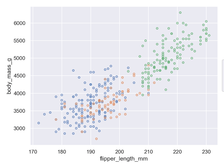
In the next few steps, we will see how to customize the plot further. First we show how to colors the dots or points in the scatter plot by a categorical variable.
(
    so.Plot(penguins,
            x="flipper_length_mm",
            y="body_mass_g",
            color="species")
    .add(so.Dots())
    .save("Seaborn_objects_scatter_plot_example2.png",
           format='png',
           dpi=150)
)
In this example below we are coloring the dots by species variable.
Next we fill the open dots by another categorical variable. And also specify the transparency for filling. using. fillalpha argument to Dots() function.
(
    so.Plot(penguins,
            x="flipper_length_mm",
            y="body_mass_g",
            color="species",
            fill="sex")
    .add(so.Dots(fillalpha=.8))
    .save("Seaborn_objects_scatter_plot_example3.png",
          format='png',
          dpi=150)
)
Now we have scatter plot between two numerical variables with two additional categorical variables on the plot using color and fill.

Finally, we change the size of the dots by values of a quantitiative variable in the data.
(
    so.Plot(penguins,
            x="flipper_length_mm",
            y="body_mass_g",
            color="species",
            fill="sex",
            pointsize="body_mass_g")
    .add(so.Dots(fillalpha=.8))
    .save("Seaborn_objects_scatter_plot_example4.png",
           format='png',
           dpi=150)
)
In our example we have added size based on the body mass. On the scatterplot the penguins with large body mass will have large dots compared to penguins with small body mass.

Love the new grammar of graphics API offered by the Searborn version 0.12.0. Looking forward to learn how to make the most typical plot I make regularly like, bar plot, histogram, facetting in a next blogpost. Hopefully sooner than later.
The new Seaborn version 0.12.0 is not all about the new interface, a lot of existing Seaborn functionalities have got a quite few enhancements. Check out what is new in Seaborn. 0.12.0 here at http://seaborn.pydata.org/whatsnew/v0.12.0.html. Two such enhancements that I excited about is the enhancement to specify error bars and refactored categorical scatterplot functions stripplot and swarmplot.


