

As part of understanding and fine tuning ggplot2’s theme elements, we will focus on the anatomy of line elements and see 15 tips to control them with ggplot2’s theme system. With ggplot2’s theme system we can control the “non-data” elements of a plot made with ggplot2. ggplot2’s theme system comes with multiple element_ functions,
- element_text()
- element_line()
- element_rect()
- element_blank()
And we learned about element_text() in the previous post. In this tutorial we will focus on the theme element element_line(). We will learn 15 tips to have finer control over the “colors, line type” for many part of line elements in a plot.
Anatomy of ggplot2’s element_line()
With element_line(), we can customize all the lines that are not part of data. For example, we can customize the color of x and y axis lines, we can make the axis lines as arrows, and we can add second x-axis on top and so on.
To give a more specific example, to control the color of x axis line, we will use “axis.line.x” element as argument to theme() function and use element_line() to specify the color of the x-axis line.
Here is element_line() function with the available arguments and their default choices. In this tutorial, we will mainly focus on changing color, size, line type and arrow using theme().
element_line(
  colour = NULL,
  size = NULL,
  linetype = NULL,
  lineend = NULL,
  color = NULL,
  arrow = NULL,
  inherit.blank = FALSE
)
Broadly, with element_line() we can customize three groups of lines in a plot. First, and X and Y axis lines. Second is the lines associated with tick on X and Y axis. And the third is the major and minor grid lines along both X and Y axis. The figure below shows the anatomy of line elements and the key word in ggplot2 describing the element.

In total there are 15 ways (at least?) we can control the three broad aspects/elements of lines in a plot made with ggplot2. Here is the list of the elements that we can control using using element_lines().
Theme elements to control the X and Y axis lines.
- axis.line.x: to customize x-axis label/title
- axis.line.x.top: to customize x-axis label/title
- axis.line.x.bottom: to customize x-axis label/title
- axis.line.y: to customize y-axis line
- axis.line.y.left: to customize y-axis line on the left
- axis.line.y.right: to customize secondary y-axis line on the right
Theme elements to control the ticks on X and Y axis
- axis.ticks: to customize both X and Y Axis Ticks
- axis.ticks.x: to customize X Axis Ticks
- axis.ticks.y: to customize Y-Axis Ticks
Theme elements to control major and minor grid lines on X and Y axis
- panel.grid.major : to customize major grid lines on x and y axis
- panel.grid.minor : to customize minor grid lines on x and y axis
- panel.grid.major.x: to customize major grid lines on x-axis
- panel.grid.major.y: to customize major grid lines on y-axis
- panel.grid.minor.x: to customize minor grid lines on x-axis
- panel.grid.minor.y: to customize minor grid lines on y-axis
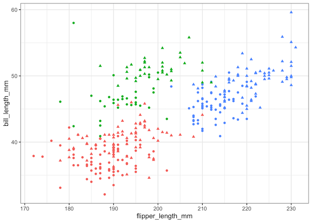
Let us get started by making a scatter plot using ggplot2 with common text annotations like title, subtitle, legend and tags.
library(tidyverse)
library(palmerpenguins)
theme_set(theme_bw(16))
We use Palmer penguins data make the scatterplot. Check out the labs() function for variation addition to the plot. We use theme_set() option to make the plot in black and white theme with pre-specified font sizes.
p <- penguins %>%
  drop_na() %>%
  ggplot(aes(x = flipper_length_mm,
             y = bill_length_mm,
             color = species,
             shape = sex))+
  geom_point()+
  theme(legend.position = "none")

p
And this is how the scatter plot looks like this. We have saved the code to make the plot as a variable and use it use it to customize 10 different text elements of ggplot2’s theme using element_text() function.

1. Customizing ggplot2 x-axis line with axis.line.x
p + theme(axis.line.x = element_line(linetype = "dashed",
                                  color = "red",
                                  size = 2,
                                  arrow = grid::arrow()))
ggsave("customize_axis_line_x_element_line_ggplot2.png")


2. Customizing ggplot2 x-axis line with axis.line.x.bottom
p + theme(axis.line.x.bottom = element_line(linetype = "dashed",
                                  color = "blue",
                                  size = 2,
                                  arrow = grid::arrow()))
ggsave("customize_axis_line_x_bottom_element_line_ggplot2.png")

3. Customizing ggplot2 top of x-axis line with axis.line.x.top
p + theme(axis.line.x.top = element_line(linetype = "dashed",
                                  color = "blue",
                                  size = 2,
                                  arrow = grid::arrow()))+
  guides(x.sec="axis")
ggsave("customize_axis_line_x_top_element_line_ggplot2.png")

4. Customizing Y-axis Line with axis.line.y
theme: axis.line.y
p + theme(axis.line.y = element_line(color = "red",
                                  size = 0.5,
                                  arrow = grid::arrow()))

5. Customizing Y-axis Line on the Left with axis.line.y.left
# theme: axis.line.y.left

p + theme(axis.line.y.left = element_line(linetype = "dashed",
                                  color = "blue",
                                  size = 2,
                                  arrow = grid::arrow()))
ggsave("customize_axis_line_y_left_element_line_ggplot2.png")

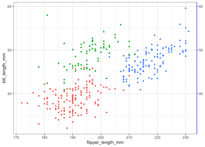
6. Customizing Secondary Y-axis Line on the Right with axis.line.y.right
p + theme(axis.line.y.right = element_line( color = "blue"))+
  guides(y.sec = "axis")
ggsave("customize_axis_line_y_right_element_line_ggplot2.png")
7. Customizing Both X and Y-axis Ticks with axis.ticks
p + theme(axis.ticks = element_line(color = "red", size = 2))
ggsave("customize_axis_ticks_element_line_ggplot2.png")

8. Customizing X-axis Ticks with axis.ticks.x
p+ theme(axis.ticks.x = element_line(color = "red", size = 4))
ggsave("customize_axis_ticks_x_element_line_ggplot2.png")

9. Customizing Y-axis Ticks with axis.ticks.y
p+ theme(axis.ticks.y = element_line(color = "red", size = 4))
ggsave("customize_axis_ticks_y_element_line_ggplot2.png")

10. Customizing grid major with panel.grid.major
p + theme(panel.grid.major = element_line(color = "blue",
                                       size = 1))
ggsave("customize_panel_grid_major_element_line_ggplot2.png")

11. Customizing grid minor lines with panel.grid.major
## panel.grid.minor
p+ theme(panel.grid.minor = element_line(color = "steelblue4",
                                       size = 1,
                                       linetype = "dotted"))
ggsave("customize_panel_grid_minor_element_line_ggplot2.png")

12. Customizing grid major on y-axis with panel.grid.major.y
p+ theme(panel.grid.major.y = element_line(color = "purple",
                                       size = 1,
                                       linetype = "dotted"))
ggsave("customize_panel_grid_major_y_element_line_ggplot2.png")

13. Customizing grid minor on y-axis with panel.grid.minor.y
p+ theme(panel.grid.minor.y = element_line(color = "purple",
                                       size = 1,
                                       linetype = "dotted"))
ggsave("customize_panel_grid_minor_y_element_line_ggplot2.png")

14. Customizing major grid lines on x-axis with panel.grid.major.x
p+ theme(panel.grid.major.x = element_line(color = "purple",
                                       size = 1,
                                       linetype = "dotted"))
ggsave("customize_panel_grid_major_x_element_line_ggplot2.png")

15. Customizing minor grid lines on x-axis with panel.grid.minor.x
#theme panel.grid.minor.x
p+ theme(panel.grid.minor.x = element_line(color = "purple",
                                       size = 1,
                                       linetype = "dotted"))
ggsave("customize_panel_grid_minor_x_element_line_ggplot2.png")


2 comments
Comments are closed.