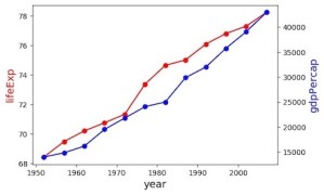
Sometimes, as part of a quick exploratory data analysis, you may want to make a single plot containing two variables with different scales. One of the options is to make a single plot with two different y-axis, such that the y-axis on the left is for one variable and the y-axis on the right is […]
8 tips to make better barplots with ggplot2 in R
Barplots or barcharts are extremely handy visualization technique for a variety of situations. It is of great use when you have multiple of categories and quickly visualize the counts of each category. In this post, we will start with how to make simple barplots using ggplot2 in R. Then we will see many examples of […]
How To Change Legend Title in ggplot2?
In this post, we will see multiple examples of how to change the legend title in ggplot2. When you make a plot with ggplot2 and color/highlight data points by a variable in the input dataframe, ggplot2 uses the name of the variable present in the dataframe. However, sometimes you might want to change the legend […]
8 ggplot themes to make your plots look great
ggplot2 is awesome. It enables people to easily make high quality data visualization plots. However, people who spent a lot of time with ggplot2 have love/hate relationship with the default ggplot2 theme, where a plot is on a grey background. The default ggplot2 theme is called theme_grey() or theme_gray(). In addition to the default theme, […]
How to Add Group-Level Summary Statistic as a New Column in Pandas?
In this post, we will see an example adding results from one of aggregating functions like mean/median after group_by() on a specific column as a new column. In other words, we might have group-level summary values for a column and we might to add the summary values back to the original dataframe we computed group-level […]


